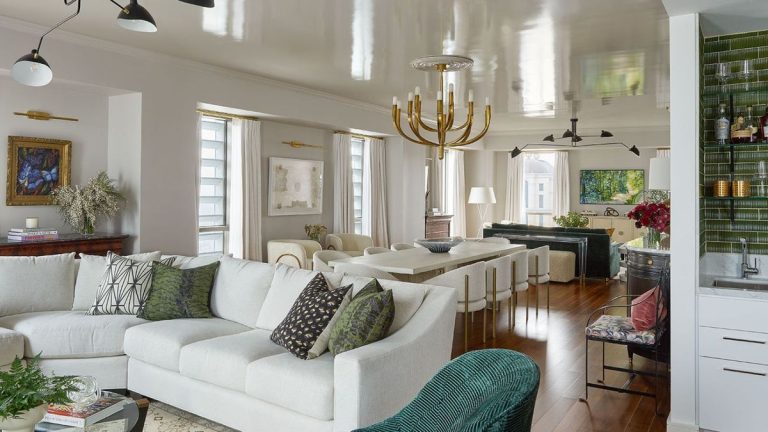
Don't mix work and play. It's a bit of an excuse, and some rules are meant to be broken anyway. The owners of this New Orleans apartment certainly think so, and they wanted their space to function not only as a comfortable, cozy base, but also as a workspace.
This private residence overlooks the Mississippi River and is located near the city's vibrant French Quarter. The mansion is part of the iconic 34-story building that was once the World Trade Center and now houses the Four Seasons Hotel, which is listed on the National Register of Historic Places. This alone would make the apartment one of the world's finest homes, but the landmark tower was recently restored and transformed into a five-star hotel, making it an incredibly desirable address.
The owners purchased the home during the early stages of the property's redevelopment and planned to stay here while in the city. They also needed to work here, so specified ample seating so they could host executive team meetings in the space. They needed the practicality of being able to lock up and go, but the interior design needed to bring the warmth and style of a home away from home.
Balancing the apartment's various functions was a challenge for designer Hattie Collins of Hattie Sparks Interiors. She set out to create a stylish, cozy home with a modern Southern vibe, but with traditional touches and new comforts. “The goal was to create a space that was contemporary and warm, peppered with antiques,” explains the designer, “while also ensuring that the interiors blended with the distinctive style of the property itself.”
So what can this apartment teach us about balancing work and living spaces in an open plan setting?
1. Create an entrance that adds an element of surprise
(Images by Alison Gootee / Styling by Paige Mullins)
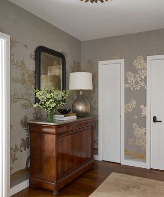
“The challenge was how to make a model unit at the New Orleans Four Seasons Hotel special and unique for the homeowners,” adds designer Hattie. “The client purchased the unit as it was under construction, and while the standard condo was top-notch and had beautiful bones, it lacked the personal touch of a contemporary high-rise.”
The homeowners requested that the design incorporate a few “wow” moments, and the designer's entryway idea certainly provided that wow factor and personal touch that was previously missing. By adding gorgeous gold wallpaper (by Gracie Studios), a vintage runner, a mirror and 19th century commode by Dop Antiques, and a lamp by Visual Comfort, the designer elevated the entryway to much more than a lock-and-go idea. It's now a welcoming space with personality.
2. Be bold and creative with your spatial design
(Images by Alison Gootee / Styling by Paige Mullins)
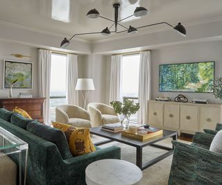
Designer Hattie Collins' living room idea was bold and original, and executing it required reconfiguring the apartment to achieve the right balance between private and public spaces for this dual-purpose home. Making the most of your available space, even in a part-time home, is essential, but as Hattie explains, it can take a bit of courage.
“The unit has amazing views – downtown on one side and the river on the other – but originally the two were separated by one of the bedrooms. Because this is the client's vacation home and not their main residence, we suggested eliminating the unnecessary third bedroom and creating a dramatic great room with views on both sides. The client chose the view, and we quickly knocked down the wall,” say the designers.
This seating area in the great room is furnished with a teal sofa and two cream armchairs, both colors that complement the artwork in the room. The great room's upholstered furniture is sourced from James Craig, Atchison Home, and Found Houston, and is all upholstered in a variety of fabrics. Artwork in the room includes paintings by Hunt Slonem and mixed media by Marjorie Pierson, sourced from Martine Chaisson Gallery. The antique rug is from NOLA Rugs. The furniture is a mix of vintage and modern from Jade New Orleans and LAM Bespoke.

Social Links Navigation
Owner, Creative Director, Hattie Sparks Interiors
Hattie Collins of Hattie Sparks Interiors is an interior designer based in New Orleans, Louisiana. Designing spaces that are elegant and sophisticated, yet relaxed, intimate and warm, Hattie's design philosophy is that no room should be off-limits. Every room should be welcoming and an authentic reflection of the client's life with light-filled interiors. Smart and comfortable, this New Orleans apartment perfectly represents Hattie's approach. She says, “This pushed my creativity out of my comfort zone. It's probably my favorite project to date because it's really helped me grow as a designer.”
3. Use style and color to unify areas of your home
(Images by Alison Gootee / Styling by Paige Mullins)
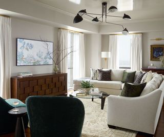
“We created harmony in the new spacious living rooms, which include two sitting areas and a dining room, through thoughtful contrast and consistency in the lighting fixtures, art, color palette and textured fabrics,” the designer says. “We juxtaposed clean millwork with beautiful antique storage furniture and traditional and transitional furnishings in warm bronze and gold hues.”
Part of the success of this open-plan room, and why it blends in with the rest of the apartment, can be attributed to Hattie Collins' approach to color. With a white sectional sofa and teal armchairs, the color scheme of this seating area almost mirrors the other living areas in the Great Room, making it a great example of why designers use color schemes throughout the home. Lighting also ties the two seating areas together, with Mouille fixtures above both areas. Additional lighting is by Visual Comfort.
4. Don't forget the fun element
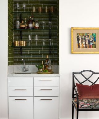
(Images by Alison Gootee / Styling by Paige Mullins)
The fact that the designers managed to find space for a home bar despite this compact alcove setup adds an extra layer of luxury to this pierre terrasse, helping to bring both entertainment functionality and a sense of style and fun to the owner both when he's alone or with the family.
We love the neat arrangement of open shelving, dark tile, under-counter drawers and the muted monochrome colour scheme of the bar.
5. Choose eye-catching paint effects for a luxurious look
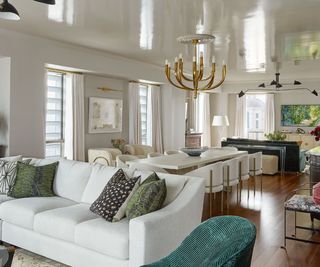
(Images by Alison Gootee / Styling by Paige Mullins)
Paint colour choices are always a topic of debate in such a multi-functional, open-plan room, but by choosing Farrow & Ball's classic Cornforth White for the walls, designer Hattie Collins ensured that the furniture would be the centrepiece. In a masterpiece of a paint effect, the ceiling has a gorgeous, shimmering finish in Fine Paints of Europe lacquer, reflecting light into the room and adding a touch of Jazz Age glamour to the dining/conference room table.
6. Make sure everyone is seated comfortably
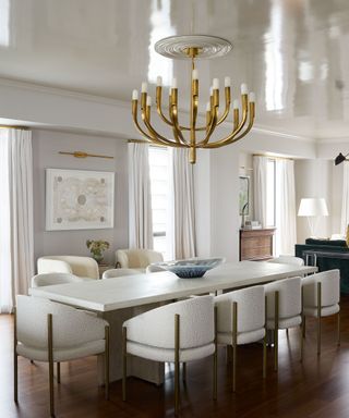
(Images by Alison Gootee / Styling by Paige Mullins)
The dining room idea proposed by Hattie Collins for this part of the living room also had to function as a home office idea, since the homeowners sometimes need to seat 12 colleagues around the Villa Vici dining table for a meeting.
The backdrop is more homey and traditional, with an antique sideboard from Fireside Antiques. Katrine Hildebrant's burnt paper pieces are from Martine Chaisson Gallery. The chandelier is from Visual Comfort and gives a unique feel to the more formal parts of this large room.
7. Opt for a minimalist kitchen in a multifunctional space
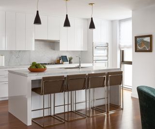
(Images by Alison Gootee / Styling by Paige Mullins)
In an open-plan, multi-functional living/kitchen/dining space, keeping the kitchen simple and uncluttered can be effective – especially when, like this apartment, there are highly decorative and wow-inducing elements within sight. The kitchen was specified and fitted during the developer's initial renovation of the building, but designer Hattie Collins believes it made financial sense to leave it as is.
“If I could change anything about the finished project, it would be some of the builder's choices that were already decided when the client purchased the unit and didn't make sense to remove. However, once we applied our design plans to the space, they seemed to fade into the background,” she says.
The designer's practical approach saves time and money, and the simple white kitchen is stylish yet doesn't distract from the apartment's business workspace elements.
8. A bedroom that combines luxury and individuality
(Images by Alison Gootee / Styling by Paige Mullins)
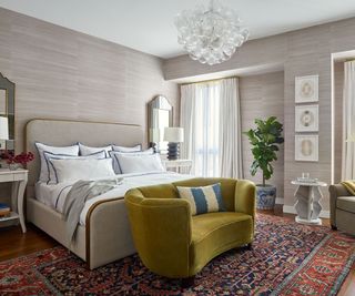
The New Orleans villa's public business areas feature clean white walls and are enlivened with hand-picked furniture, artwork, and vintage finds, while the home's private spaces offer more personal touches and a more eclectic style. “Mixing was really important in this space, and it reminded us of how powerful the well-placed pieces of antiques and vintage rugs can be in a home,” says designer Hattie Collins.
Anyone looking for unusual bedroom ideas will be enchanted by the beautifully textured grasscloth wallpaper from Schumacher that wraps around the master bedroom and the 1940s Danish mohair loveseat that adds a delightful splash of colour alongside an antique rug from Nola Rugs.
Other key pieces include nightstands and chairs by Atchison Home, lamps and chandeliers by Visual Comfort, and Kathryn Hildebrandt's burnt paper works from Martin Chaisson Gallery. Bedding is by Matouk.
9. Play with patterns to add warmth to your room
(Images by Alison Gootee / Styling by Paige Mullins)
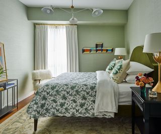
We're often asked for advice on how to decorate a guest bedroom, and we think designer Hattie Collins has nailed it in this rather small second bedroom. She takes it a step further by using a muted pale green textured wallpaper (Schumacher's Grasscloth) on the walls and a darker green on the headboard, playing off the accent color from the living room. The patterned bedspread (a Schumacher x Matouk collaboration) brings the whole look together in a more playful way, and along with the vintage rug, it adds personality and warmth to the overall look.
Other notable pieces include a bed by Coley Home, lamps and chandeliers by Visual Comfort, nightstands by Atchison Home and a wall sculpture by Clark Derbes.
10. Add impact to your powder room with bold wallpaper
(Images by Alison Gootee / Styling by Paige Mullins)
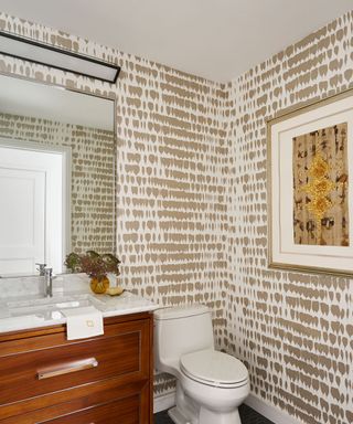
The restroom idea, conceived by designer Hattie Collins, is designed to make a stylish impact and impress visitors. The unexpected moment here comes from the quirky Schumacher wallpaper, combined with art by Andrew Fisher acquired from the Martin Chaisson Gallery. The plan shows how effective a striking wallpaper can look in a small space.
Interior design: Hattie Collins of Hattie Sparks Interiors
Photo: Allison Gootee
Styling: Paige Mullins

