 © Akira Nakamura


 +17
+17
Share Share
Post
or
https://www.archdaily.com/1014412/a-round-and-around-home-renovation-hams-and-studio Area Area of this architectural project Area: 65㎡ Year Completion year of this architectural project Year: 2024 Photo Manufacturer Brands of products used in this architectural project
Manufacturers: Ferrum+, Haymes Paint, Kvadrat, TAJIMA ROOFING
Lead architect: Yota Hokihara (HAMS and, Studio) + Ken Kazama
 © Akira Nakamura
Textual description provided by the architect. When I open a book, the words run through my head. When you open the windows, you can see cars and trains rushing from town to town. When these activities take place, the inside and outside are seamlessly connected. In a world where there is an increasing trend toward non-ownership, this home was designed by an architect to be surrounded by precious things that he has accumulated over a long period of time, dragging his past self with him.
 © Akira Nakamura
 plan
plan © Akira Nakamura
The site is located in a densely populated residential area at the foot of Tokyo Skytree. Although it is a room in an apartment building, the main road runs right in front of the building, and local trains run at the same height as the room, making it a location where you can feel the dynamics of the city firsthand. The existing room had been renovated by a real estate resale company. I had the impression that the unique potential of the flat structure of the apartment was being suppressed. In this renovation, we considered the finishes that had already been renovated as a topography and context. The aim is to explore the nature of private living spaces that expand as part of the overall urban activity, and by “parasitizing” the existing context, it influences the entire space while having maximum effect with minimal intervention. was to give.
 © Akira Nakamura
 section
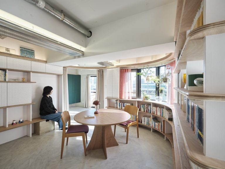
The new resident of this room had a huge collection of books and longed for a life surrounded by various treasures. So I came up with the idea of incorporating a circular bookshelf in the center of the floor plan. By making this 360-degree central space the living room, we thought that residents would be able to have a lively and interactive relationship with their belongings. Therefore, we decided to incorporate the characteristic curve of the exterior wall into the interior space. A circular bookshelf that echoes the curve of the exterior wall forms the framework of the space. We incorporated flow lines, fixtures, benches, etc. into this framework, and arranged the bookshelves so that they intertwined with existing elements such as small rooms, hallways, kitchens, washrooms, and bay windows.
 © Akira Nakamura
We started with renovations that prioritized business profitability, but we aimed to create a comfortable space with minimal renovation while maximizing the existing functions. This pursuit involves a certain level of paradox. We recognized the subtle textures and uniformity of recycled vinyl wallpaper and wood-grain vinyl floor tiles, and took them as topography and foundations for the project. This approach makes it possible to actively embrace characteristics that would not be possible in a new building or complete renovation.
 © Akira Nakamura
 shelf section
 © Akira Nakamura
 © Akira Nakamura
Currently, real estate resale companies are rapidly performing uniform renovations on promising used condominiums. This project was born out of a heartfelt desire to create a space of one's own, surrounded by important things, through partial renovations that take advantage of the temporal and spatial gaps in the city. This project aims at a new approach to partial renovation.
 © Akira Nakamura
Source link

