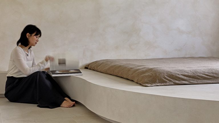
AEN is a designer and engineer who contacted us a while ago about the renovations they were doing on a new HDB apartment. Looking at the photos, you can see that it is more of a redesign than an HDB renovation. And it's not like anything we've ever presented before. We were very surprised by its minimalist design. Now that it's completed, I'm happy to show it to you all.
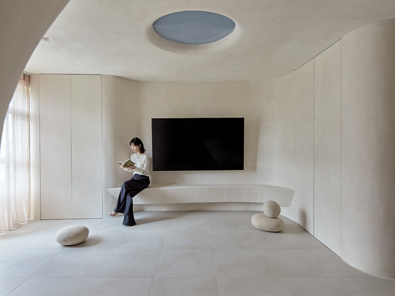

Aen and Pei Tsir bought a four-room custom-built home and have lived there for more than a year. They have lived in Yishun for most of their lives, and this time they chose a quieter part of the neighborhood, near the Lower Seletar Reservoir, to be closer to nature.
Please tell me about HDB renovation.
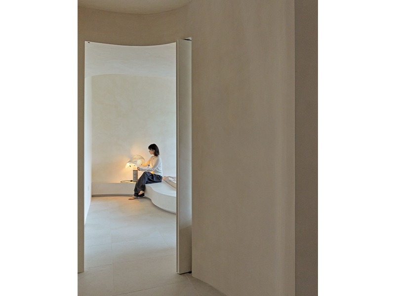
We wanted our space to feel as if it had existed long before we lived in it, as if we had found a cave and settled there. . Visually, I wanted it to be raw and simple so it didn't feel artificial. But also to recreate the safety and permanence of caves.
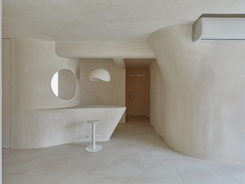
We were inspired by Mediterranean and Middle Eastern houses carved out of rock. We also focused on a single color and limited texture throughout the space. The more homogeneous it is, the more cave-like it feels.
There are almost no entrances, so you can immediately access the large living space. There was no need to design any special rituals, so the entire space is large and flexible for spontaneity. We removed all existing walls and reallocated the space.

Describe how minimalist design is applied to home decor.
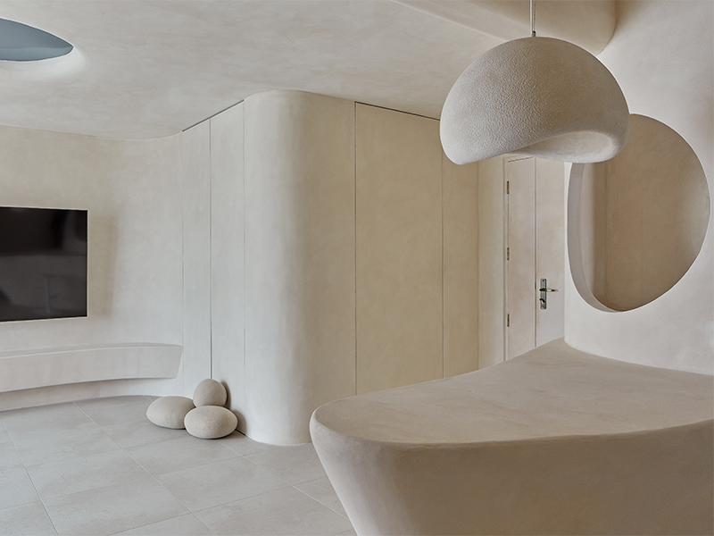
I put off buying bulky furniture so my living space could adapt to any purpose. You can easily turn it into a workout space or host friends or a movie night without getting in the way.
We selected the largest TV that could reasonably fit on the wall without sacrificing aesthetics or viewing distance. A 75-inch screen made the most sense. It is hung on a curved wall and all the cables are hidden inside it. These cables connect the TV to electronic devices such as streaming devices and game consoles hidden in the carpenter's room.
The television floats above a console that appears to have been carved into the wall. All of the storage is built into the walls, keeping the living room open and airy.

The kitchen looks cool too!
With no carpentry on the walls, we were able to keep the part of the kitchen visible from the living room as open as possible and increase the use of space towards the end of the kitchen where the service yard was.
We kept the boundaries between the kitchen and living room blurred and open so that everyone working in the kitchen felt part of the activity in the living room area. The sinks and faucets are all off-white, avoiding the harshness of chrome or stainless steel.
Talk to us through the bedroom.
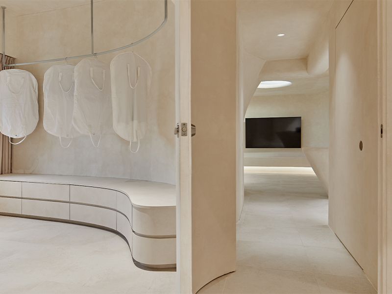
The second bedroom was integrated into the original master bedroom to create a more open room with a seamless dressing area. In place of a walk-in wardrobe, we offer a walk-over dressing area with boutique-style clothing racks to complement your collection of apparel, bags and accessories.
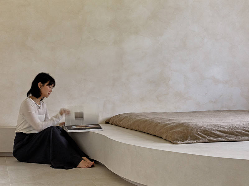
Our bed extends across the window with a raised platform that integrates with a long work table for working from home. You can work while checking the weather outside. Rainy days with cloudless blue skies are especially nice.
The hotel-grade mattress fits into a deep recess in the platform, with its top almost flush with the surface of the platform. It feels like sleeping on a big rock and you don't have to worry about it falling off the side of the bed.

What kind of bathroom did you choose for your HDB apartment?
In the master bathroom, both the toilet bowl and sink are wall-hung and shaped like pebbles. The faucet is made of the same white color as the kitchen sink faucet, so you won't notice the rough texture of chrome or stainless steel.
There were no shelves or storage in the house, it was like a real cave, and toiletries were left on the floor, as if there was no way to organize things. We chose the INAX rain and shower kit because its Japanese aesthetic matched the rest of the space.

That's quite a feat. How do you feel now that it's completed?
We accomplished most of what we set out to create: a quiet, open cave. It definitely gives a rest to the tired mind after a long day. We're still getting used to not having furniture, but we plan to keep it that way.
We're still figuring out ways to make spending time in our living rooms more physically comfortable and allow us to be more together as a family.
As we begin to form habits and establish routines, there are little flaws here and there. However, we will continue to work on this space as an ongoing project.

We are very impressed with their efforts. There aren't many other HDB renovations like this. congratulations! If you have created something you would like to show us, please contact us at info@expatliving.sg.
To make the most of your time in Singapore, read our latest city guide for free here.
This minimalist designed HDB flat was first featured in Expat Living's April 2024 issue. You can also purchase the latest issue or subscribe, so you won't miss out!

